
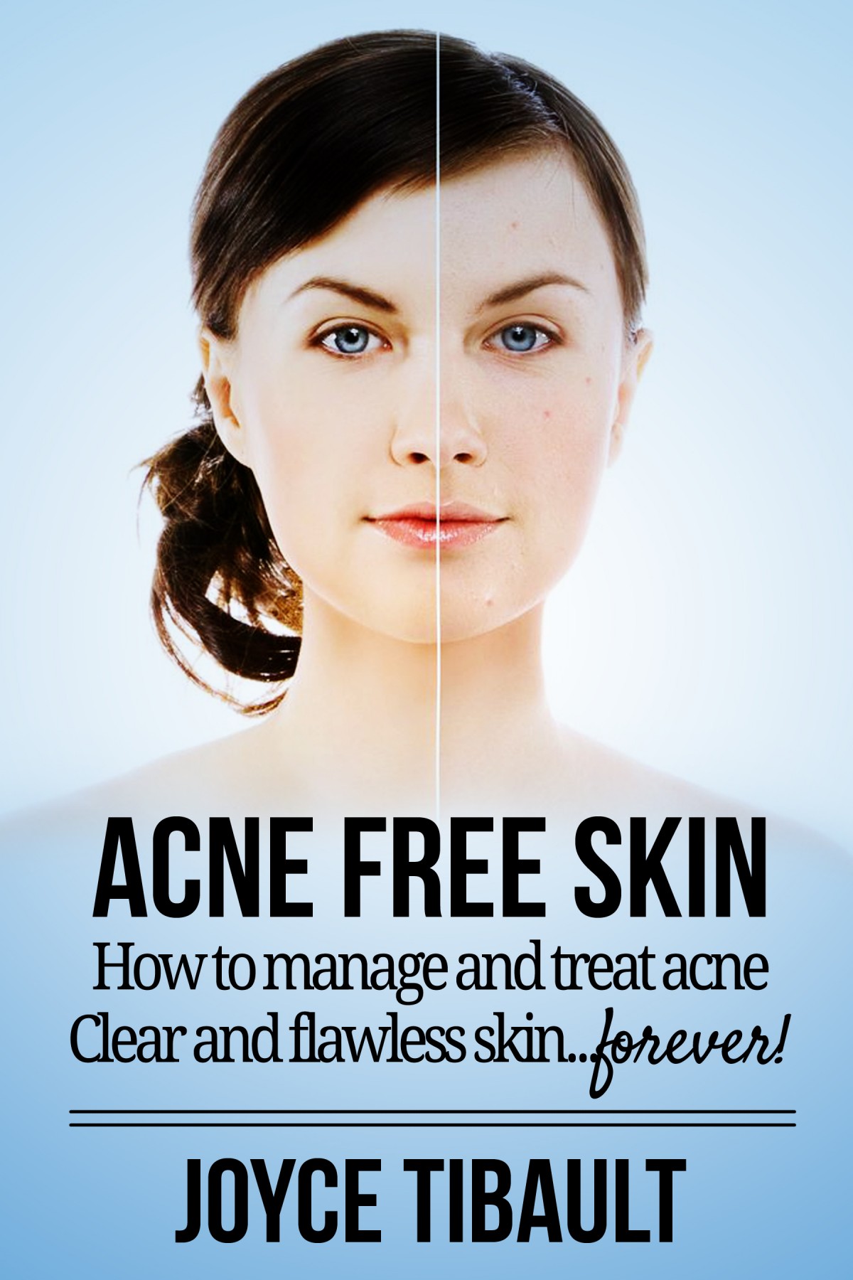
The author contacted me to redo her cover with the stipulation that I use the original image. She wanted me to create a cover that looked cleaner and more professional than the one that was originally being used. So after doing some research, I went with a blue background because it’s a neutral color and I noticed a lot of acne commercials used a light blue. I also cleaned up some of the old typography and used more modern fonts.
2014.